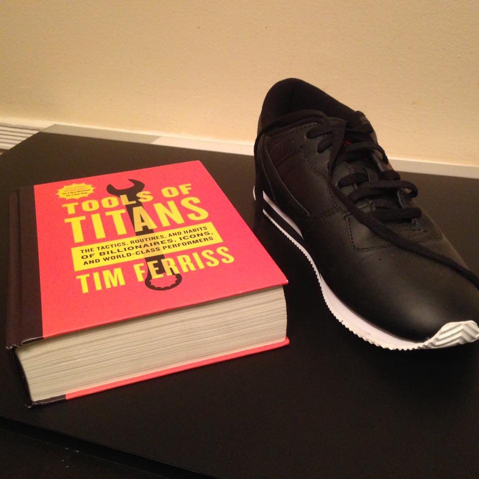
Tim Ferriss created Tools of Titans, and we decided to start a little group to discuss it. It was offered free on Amazon for Prime subscribers, but I decided to go ahead and purchase the book when it came in (see the size of the book in this blog post).
This was great timing because I had been thinking about tools for titans-in-progress, like myself.
The thing that I first noticed about the book was the way it was designed.
It's like...a toolbox. That's a genius way to go about constructing a book and what I assume Ferriss was going for with the way it was all compiled.
Starting there, here are some things that I noticed:
The Toolbox Format:
Yo. This thing is a big box full of tools. It's like a...toolbox? Huh. Okay. I'm intrigued.
The Color:
The book is traffic cone orange, safety vest yellow, and a workshop black. These colors are all classic visuals used by hardware stores and brands like Home Depot and Black & Decker. This not only sticks out, but it makes a natural statement about what the book is for.
The Size:
It's a big book; definitely bigger than most business or self-improvement books.
The Cover Font:
The text is an Impact style font meant to be seen as standing tall and strong, literally what the Impact font is for. And if you don't know what the Impact font is, they use it for memes so they can get a
I even made a painting once called 900 Point Impact. I'm still mad because that title is lost on most people. I'll make a note to revisit that idea.
The Cover Icon:
For simplicity and focus, there is one, singular tool on the front.
Also, it's not a hammer, a screwdriver, hardhat, or drill, but a racketing wrench. A racket wrench isn't the most visually iconic tool to use, but it works in a lot of business metaphors. It also subtly references how one would tighten/loosen the "nuts and bolts" of an operation. Combine that with it's simple and straight-forward design, and you have a beautifully constructed focal point for the cover.
For contrast, consider the different approach and effect that you get from a book like "Visual Hammer" by Laura Ries.
The Forward:
Arnold Schwarzenegger lays out the idea in the forward that people need tools to build the life that they want. This is appropriate to the book is going for. Arnold is definitely a titan to start this off as well. He's also got the vibe that would fit for a heavy ass toolbox of a book.
The Table of Contents:
This table of contents isn't so much a table as it is a set of shelves in a toolbox. Reminds me of opening up a toolbox and seeing different sets of tools that I can rummage through and get what I need. Pretty much how the contents were laid out here.
The Instruction Manual:
Tools of any appreciable complexity or with a certain presentation will contain usage manuals. This book is no different, and Ferriss does a good job of putting you in the mindset of how to work with this book.
In fact, before I read the instructions, I started using the book like any tinkerer would: by grabbing a few tools and seeing how they operate and what they can do. Amazingly, that's EXACTLY what people that make instruction manuals assume: many people will just jump right into the book.
Conclusion:
This seems to be a well-designed book that's going to fit my needs. The writing is a separate thing altogether, and I'm enjoying the nuggets. But you can't go too wrong with the resources he's gathered and the structure that he's built. So I'm all in for this one.
Have you read this or are interested in it? Let me know in the comments.
- Benja -
No comments:
Post a Comment